Design System: Components Properties Naming and Arrangement
by El Piven
3 min read
During the development of a large Design System, I encountered a challenge: how to name components and their properties in a way that ensures consistency and ease of comprehension for multiple designers, both those creating and those using the Design System.
What I’m sharing here is the final generic approach I arrived at after research, experimenting with different methods and making adjustments with my team.
This approach works well for me, my team, and the Design System in my company. However, it may or may not work for you, depending on your specific needs and requirements.
General Naming Rules
Use Capital Case letters and spaces for Component names: Capital Case Name. E.g.:
ButtonText AreaIcon Button
Same for a component property name. E.g.:
Leading IconButton TextGroup Title Text
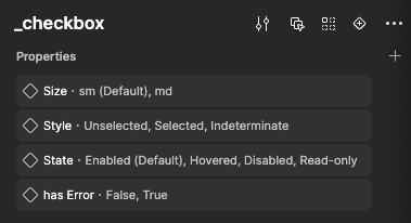
For components that serve solely as building blocks for other components and are never used on their own, use a differentiator - a “_” (underscore) preceding the lowercase name, and use a “-” (dash) instead of spaces: _lowercase-name
_checkbox- serving for Checkbox Group_table-cell- serving for Table
Exclusions:
-
prepositons such as of, in, etc., do not require capitalization.
Number of Avatars
-
is for boolean states, such as:
is Interactiveis Selected
-
has for properties indicating possession, such as:
has Errorhas Iconhas Date of Birth
Punctuation Rules
- In Components names: do not use punctuation marks, except for space and the “-” (dash)
- In Properties names: do not use punctuation marks, except for space, ":" (colon) and the "—" (em dash) (both used for Groups)
Property Order
Start with the Size property, followed by Type(e.g.,Primary, Secondary etc), Status (e.g., On/Off, Empty/Filled), Style (related to appeariance) and close the main group with State (e.g., Disabled, Hovered etc). It can also include some defferentiators such as:
is Inteactiveis SelectedIs Typable
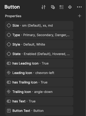
Then include everything else that is less important, focusing more on the component’s parts rather than the whole. For example:
has IconIconButton Text
Appropriate property usage
Type / Style
- Use Type property for main differentiators (e.g.,
Primary,Parent,Business Partner). - Use Style for all secondary, stylistic properties (e.g.,
Outline,Success,Red,Beta,Indeterminate,Top Arrow,Horizontal).
Status
- Use Status for binary states, such as
Off/OnorEmpty/Filled.
State
-
Use State for user interactions, such as:
EnabledHoveredPressedFocusedVisitedDisabledRead-Only
-
Use ✅ is Selected property instead of 🚫
State: Selectedfor the selected state of a component. This is because a component can be simultaneously selected and focused. -
If there are Selected, Not Selected, and Indeterminate states, use ✅ Style property to differentiate them.
Property Naming
Error State
- Use name: ✅ has Error instead of 🚫 is Errored for error-related properties.
Directional Terminology
- Use ✅ Leading / Trailing instead of 🚫 Left/Right.
Text Property
- Use the format: {Element Name} Text for naming text layers.
Label Text
Group
- For containing groups use "—" (em dash): —has Group: {Group Name}
-
—has Group: Leading Box -
—has Group: Label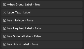
-
Property values
- Mark the default value explicitly, for example:
Primary (Default)Enabled (Default)
-
For Size: use clothing size system:
xxs, xs, sm, md, lg, xl, 2xl -
For Boolean properties use:
- ✅ True and False instead of
- 🚫 Yes and No